Maximum connectivity with foresight focus
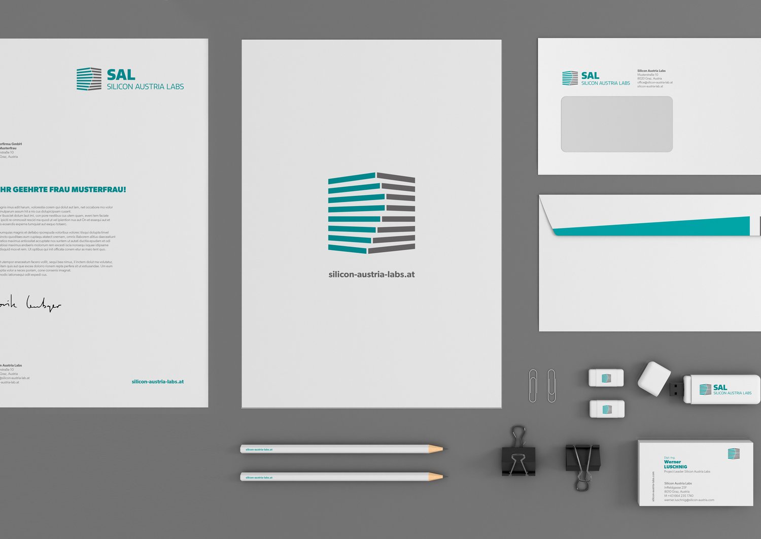
Connectivity is the principal concept of the SAL logo. The two coloured bars do not only approach each other, but are also oriented towards the front in a radial constellation. This symbolizes our foresight and focus on research in the field of electronic based systems. In line with our logo, we strive to achieve the maximum knowledge-building connectivity by bringing together the best researchers and connecting with top partners. That's how we want to face the future of electronic based systems.
The three-dimensional unity
Has it struck you what makes our logo look three dimensional? Here it is: The bars would appear one dimensional without the different colored ones on the other side. Only due to the interplay between them do we perceive the logo as three dimensional. It also reflects how new potential is created – with the help of an additional dimension.
Connectivity for innovation strength
With this multidimensional accentuation we emphasize the power of connectivity created by SAL by connecting industry and science as well as various sites, teams and research areas. That's how SAL becomes a leading research center and pioneer for electronic based systems.


